The Past

ELMWOOD_PRESENTATION


This was the presentation that was submitted to Elmwood. While none of the designs were printed, the direction has been fully designed and followed through. 

Once again, Joel produced the boards from the images I had created. We reduced the amount of text on each slide, and made each board concise and add a new element to the branding as the presentation went on. 

The branding has taking  very coherent aesthetic, however the brand itself seems a little confusing. There needs to be more clarity in the design and overall visual language, but I will call upon this in further crits in order to get feedback. 

ELMWOOD_DEVELOPMENT


The development of the brief has been very fluid and quick. Once the direction and concept was sorted the visual style seemed to take control of it’s self. Being an economy style I did not want the visual style to divert away from this theme. Half tone images and single colours on white were what was needed to convey such a concept. 

While the visual style seems to be asserted, I feel that the branding components could be improved. There is something about the branding which has not quite worked. However, I feel it is at a good enough stage to submit to Elmwood. I would like to develop this brief further to tighten it up in lieu of the potential Elmwood presentation. 

CRIT_TBM


The crit with The Beautiful Meme was a new and interesting form of crit. After presenting our work we received a very honest professional crit. 


What was said?

Ben, the creative director at The Beautiful Meme, gave a brilliant crit. He acknowledged the strength of the ideas, but gave feedback about some potential issues about taking the concept further. 

Some of the issues were the legibility of the NEW logo, and also the idea of using NEW to represent Northern Ireland England and Wales. 


How will I act on this?

For me this was only a short brief, so I wanted to use this as an exercise. I will act on polishing the brief in order to give it a chance of being inducted into my portfolio. I think there are some ideas that can be built on and giving some visual strength in order to be put into my portfolio of work. 


FLAG/TBM_CONCEPT&DEVELOPMENT


The development for this brief went rather well. I particularly enjoyed it because I was allowed to include rationality in the decisions. From the outset I thought their must be more to the brief than ‘revolution' and ‘evolution’ so I set out to achieve both. I felt that creating a completely different flag was completely irrational, but looking into how the new flag could be introduced really interested me. 

The idea of creating a campaign around a new flag was what set me on a path to answering the brief in my way. The brief desired more than a new flag, but was open to a range of interesting possibilities and speculations about what could happen once the flag had been changed. 


Joel put together some boards that summed up our rationale. The presentation included the images that I put together for the proposal in order to be taken to the crit with The Beautiful Meme. 

CRIT3


Ahead of the crit at the Elmwood studio. Joel and I wanted feedback on our concept and how we might make the presentation of it stronger. 

The crit group highlighted that the images were very small, and less impactful. They highlighted that the presentation should make a statement, and having lots of things going off on one board was not the way to submit.

The crit group highlighted that the copy on the boards was good and easy to read, however in places it was a tad more than needed. 


How will I act on this?

To act on this I will increase the amount of boards, but dramatically decrease the amount on each board. I will take on board the comments about the copy and proceed to decrease this as much as possible in order to make a more impactful presentation, and a more concise delivery. 

ELMWOOD_CONCEPT


The concept stage for this brief has been a struggle. The process was slow, however I feel the correct process stages were undertaken. Multiple possibilities were explored and the most appropriate was pursued and developed. Trying to develop the brief proved difficult and it was difficult to pin down the name and final brand concept. The overarching concept was to look toward budget branding and have an economy style. The branding wanted to be blunt and no-nonsense with a view to amplifying the no frills feel. 

CRIT_ELMWOOD


At the crit today, Steph Oglesby (ex-LCA student and current designer at Elmwood) came in to give a  crit about the brief set by the studio. At the crit, some very questionable design sheets were shown, with two very different concepts in mind. 

The first concept was to exaggerate the idea of the Doggy Hotel. A cliche and somewhat repugnant idea of a dog’s accommodation. This idea, although could be fun to produce was not necessarily a unique response. 

The second concept was to follow the path of a budget-economy dog hotel, for the family who are looking after their cash, and saving it for the holiday. 

Steph gave us guidance and expressed more interest in the economy brand idea. This was due to the way that dog hotels not really branded this way, and it would be an interesting route to take.


What I took away

I took away that I should follow the route that has been less worn. The idea of a pushing a brand idea from where it is usually taken could potentially lead to a more innovative and appropriate response. This not only goes for this brief, but is something that I can build on for branding briefs in the future. 

BLADE_RESEARCH


What did I do? 

Once again the Blade research seemed to be very superficial as I conducted it too early. This has definitely made me aware that research can not be conducted right at the beginning of a brief. The research I did was mainly on other Barbershops. I paid particularly attention to a Barbershop in Sheffield, as I felt this had a similar feel to what the owner of Blade wanted to achieve. 


What should/will I do? (because this brief is under development, and will be a longer brief, I will write some things that I can do to make the brief stronger)

I think that I should be in close contact with the Barber and his staff to see what it is that they want. I think I should do some research into competition within the city. While I am aware of some, I think it will be valuable for me to document the competition within the city in order for me to put forward a more solid, and contextualised proposal. 

If the brief was a larger scale brief, I could potentially conduct interviews with the users of the barbershop to see what their thoughts are on the current barbershop as it stands, and what they like so much about it. 

CRIT2


The research from the crit was, on the whole, very good. The crit highlighted that the design direction for DRIP answered the brief. While this was a good outcome, the work for Blade was not as succesful. One of the pieces of crit feedback said that the design was not suitable for the application which I have taken on board:


I used this method of crit in order to get some concise feedback. Rather than asking for feedback on colour choices or something superficial like that, I decided that I would invite the person giving the crit to make some assumptions about the brand. The fact that this was a false assumption means that my design is flawed, and that is all that I need to know. I will act on this, and produce a different design. To get better feedback than this, I should have asked the crit member why they got the assumption wrong. 

Once again, I feel it would have been far more valuable to take work that is in progress as this would have invited a greater degree of feedback, while Blade is in the the process stage, I feel I got some valuable feedback, but I feel I should have invited more feedback on the matter to improve my design direction. 


ELMWOOD_RESEARCH


What did I do?

The research for this brief has been very poor. The brief has had to be quite a fast turn around due to the other things that we have had going on. Unfortunately the research I did for this brief was quite superficial, and did not particularly help too much with the actual design part. I am pretty disappointed in how this part of the brief has turned out. I think the issue was that the problem was not thought through before doing research. I got caught in the trap of doign research before I fully acknowledge the problem, and this led to a poor and misinformed research methodology (if you can even call it that). 


What could I have done?

I should have definitely asked myself some questions about who would be using the brand, especially as the brand would be built from scratch. I think that I should have identified myself with the customer more thoroughly and asked myself these questions in order to improve the research. I could have visited a dog kennel and looked into whether the branding plays any part in the customer experience, and I should have interviewed people who use dog kennels. 

These are all things that I would have done if I had more perspective, time, and a budget for this research. 


FLAG/TBM_RESEARCH


What did I do?

For the research in this brief I spent my time researching the foundations of a flags meaning, and how the existing flag is applied in a range of contexts. This was a good brief to research for as it meant I would resist any form of superficial research on 'design blogs' and instead look into the heart of the matter. Doing this meant, that I was able to analyse the problem at hand, do research that would assist me in the answering of that problem, as opposed to influencing a visual style. 

I looked into a range of different things which ranged from, existing briefs set by the Guardian similar to this brief, and articles that cover a similar topic such as the one set by Coley Porter Bell. I looked further into flag anatomy from some secondary sources from the library, and this helped bring to light some technicalities of flag making that I was totally unaware of, and opened a door into a world of design that had never even occurred to me: THE FLAG.


What could I have done?

I feel that my research lacked primary research. Asking round the year group there were many different answers as to what the flag meant to each individual. In reality, vast surveys would have to be conducted in order to get a true reflection of the overall countries viewpoint. In reality, any one design would not please everyone, but I suppose that the answer would be to either not change the flag at all, or please the majority. 

As for more attainable research methods, I feel I could have experimented with the flag in a process led way, which I feel would give me an understanding of the flags form.

BRIEF_ELMWOOD


Competition Brief:
Elmwood: Brand Boring

This brief is my first competition brief of the year. The brief was set by Elmwood www.elmwood.com. The brief is to brand a boring occupation and make it interesting. The brief is my second branding brief, but I think this one provides a really good opportunity to respond to a situation that is outside of my comfort zone.

BLADE_BRIEF


Live Brief:
Blade Barbershop

This brief is another live brief with a real world context. I noticed my barber wanted some branding doing so I decided that I would create some identity materials as part of a brief and then pitch it to him. The brief is a branding brief, and my first one of the year. I do not particularly want to focus too heavily on branding this year, as there are other things that I want to try before leaving university. However, this will be a valuable brief for me as it has a real world context, and it will be a brief run across print and digital. The latter is of particular importance because I want to retry applying a brand concept over a range of diverse applications. While I am unsure whether I want to focus on branding in my future, I know that I certainly want it to be a string on my bow. 


FLAG/TBM_BRIEF


Studio Set Brief:
The Beautiful Meme


This brief was set by The Beautiful Meme www.thebeautifulmeme.com. The brief is a speculative redesign of the Union Jack if Scotland leave the United Kingdom in the Scottish Referendum next year. 


I re-wrote the brief and made it into a more thorough bodied statement.

This is brief holds particular interest due to it’s speculative outcome. I like the idea that a brief can act as speculation for an event that has not happened yet. The brief allows for forward thinking, and as Martyn said in the brief presentation, be responded to in the way of Evolution or Revolution. 

FLAG/DR.ME_PROJECT


The Dr.Me brief has been very worthwhile for me as a designer as it has allowed me to implement design in a new way. Curating design has been something that has been on my radar for a while, and it seems to make for a visually diverse exhibition. I think that it has made me aware that I am not particularly interested in pursuing a career in curation, especially of design objects. The idea of exhibiting design is a practice that is absolutely fine for those dedicated to the cause. However, I feel that the insular nature of this type of exhibition is not particularly for me to co-ordinate. 

Despite this, I very much enjoyed working on the brief itself as it allowed me to respond to instinct and work in a visceral and less pragmatic way. This is something I have not done in 4 years since my art A-Level. It came to me that I still would look for rules and restraints, as per graphic design education.

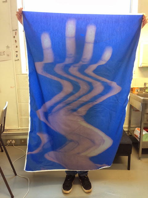
I had never printed onto material before and this is something that I now know is a possibility at college. The colours were far more washed out than I had wanted, and I feel we picked the wrong material. If I was to do it again I would have liked to print the flag onto a heavier canvas.

The design was highly process driven, which was a nice change. The majority of my work comes from arduous concept stages, and I feel that conducting this brief may push me to work in a more organic and process led way. I enjoyed this working method and I will perhaps use this as a tool, depending on the brief in future.


FLAG/DR.ME_BRIEF


Live Brief:
Dr.Me Exhibition


The Dr.Me is the second brief that I have undertaken. The brief is a quick turnaround brief as the deadline was one day to create the visuals. This is far different and somewhat more of a novelty brief than my first live brief. The brief serves the purpose of design as art, as the design will be going straight into an exhibition. This is the first time that I have treated design like this, so it is going to be a new and potentially interesting experience, from process to presentation. 

PORTRAITS_PROJECT


CRIT1


In the crit today we presented our work to the group and described the brief that we were doing. This was the first crit so there was not too much structure to the feedback given for each person. 

I presented my progression with the ‘DRIP’ brief, which included, a description of the brief, some stills of the film, some influences and design direction slides and some of the design that had developed over the last couple of weeks. 

The feedback was generally good, and it seemed that there was not much to say about the brief that I had done, other than I was on the right lines. 


How can I get better feedback? 

In the next crit I hope to ask some questions that will encourage some more informative feedback. I think the problem with what I had shown today was that it was too polished. In future I feel I should go in with design sheets and rougher sketches, in order to for the designs to invite more feedback. Perhaps if something looks too finished, the crit group feel too harsh to actually crit the work. While I think we should be beyond that now, I think it is easier and more accessible to crit design that is in development as it invites feedback and ways it can be improved and developed. 

DRIP_RESEARCH/CONTEXT


What did I do?

I tried to implement a range of research methods into this brief. I found it difficult in second year to research akin to how we had learnt to in the first year. I want to place a greater focus on research in my third year briefs so I tried to cover a lot of ground with this first brief. 

I started to do some gathering of sources for typographic style and design direction. I did this to see how typography had been applied and how it had been constructed. I evaluated their similarities and differences and how this affected the overall impression of the film. 

I looked further into children’s handwriting, as this would be a theme that would run throughout the design process. I looked into how children construct their letterforms, and I was able to locate some primary research from a young boy similar to the age of the boy in the film. 


What could I have done to push it further?

To push the research further, I could have got a greater number of samples from a variety of different children to compare them. I could have perhaps volunteered as a social worker for the day at a institution for neglected children, or I could have acquired handwriting samples from children in underprivileged areas. While these would have gained some interesting pieces of primary research, there are some boundaries with these things, that would have perhaps been a little too far for the the extent of this brief. 

GOOGLECALENDAR


Joel and I collectively put the briefs on a Google Calendar in order to plan our time. So far the time planning has gone well, and keeping a strict rota seems to work in order to keep track of briefs. I have a couple of worries about how many briefs we have on the go, and the fact that my mind is constantly shifting from one thing to the next. 

I checked out some articles about multitasking to see if what I was feeling was backed up by any research found by other people.

Source:

http://psychology.about.com/od/cognitivepsychology/a/costs-of-multitasking.htm

Quick Overview:
Multitasking can reduce productivity by approximately 40-percent according to some researchers.

Switching from one task to another makes it difficult to tune out distractions and can cause mental blocks that can slow down your progress.

Take a moment and think about all of the things you are doing right now - obviously you are reading this article, but chances are good that you are also doing several things at once. Perhaps you're also listening to music, texting a friend, checking your email in another browser tab or playing a computer game.

If you are doing several different things at once, then you may be what researchers refer to as a "heavy multitasker." And you probably think that you are fairly good at this balancing act. According to a number of different studies, however, you are probably not as effective at multitasking as you think you are.

In the past, many people believed that multitasking was a good way to increase productivity. After all, if you're working on several different tasks at once, you're bound to accomplish more, right? Recent research, however, has demonstrated that that switching from one task to the next takes a serious toll on productivity. Multitaskers have more trouble tuning out distractions than people who focus on one task at a time. Also, doing so many different things at once can actually impair cognitive ability.
What the Research on Multitasking Suggests

First, let's start by defining what we mean when we use the term multitasking. It can mean performing two or more tasks simultaneously, or it can also involve switching back and forth from one thing to another. Multitasking can also involve performing a number of tasks in rapid succession.

In order to determine the impact of multitasking, psychologists asked study participants to switch tasks and then measured how much time was lost by switching. In one study conducted by Robert Rogers and Stephen Monsell, participants were slower when they had to switch tasks than when they repeated the same task.1

Another study conducted in 2001 by Joshua Rubinstein, Jeffrey Evans and David Meyer found that participants lost significant amounts of time as they switched between multiple tasks and lost even more time as the tasks became increasingly complex.2

Understanding What the Multitasking Research Means

In the brain, multitasking is managed by what are known as mental executive functions. These executive functions control and manage other cognitive processes and determine how, when and in what order certain tasks are performed. According to researchers Meyer, Evans and Rubinstein, there are two stages to the executive control process. The first stage is known as "goal shifting" (deciding to do one thing instead of another) and the second is known as "role activation" (changing from the rules for the previous task to rules for the new task).

Switching between these may only add a time cost of just a few tenths of a second, but this can start to add up when people begin switching back and forth repeatedly. This might not be that big of a deal in some cases, such as when you are folding laundry and watching television at the same time. However, if you are in a situation where safety or productivity are important, such as when you are driving a car in heavy traffic, even small amounts of time can prove critical.
Practical Applications for Multitasking Research

Meyer suggests that productivity can be reduced by as much as 40 percent by the mental blocks created when people switch tasks. Now that you understand the potential detrimental impact of multitasking, you can put this knowledge to work to increase your productivity and efficiency.

Of course, the situation plays an important role. The costs of switching tasks while texting a friend and watching a football game probably are not going to cause any major problems. However, that fraction of a second it takes to change tasks could mean life or death for someone driving down the interstate while trying to find a good radio station or talking on the phone.

The next time you find yourself multitasking when you are trying to be productive, take a quick assessment of the various things you are trying to accomplish. Eliminate distractions and try to focus on one task at a time.

References

1Rogers, R. & Monsell, S. (1995). The costs of a predictable switch between simple cognitive tasks. Journal of Experimental Psychology: General, 124, 207-231.

2Rubinstein, Joshua S.; Meyer, David E.; Evans, Jeffrey E. (2001). Executive Control of Cognitive Processes in Task Switching. Journal of Experimental Psychology: Human Perception and Performance, 27(4), 763-797.

Multitasking May Not Mean Higher Productivity. (2009). Talk of the Nation, National Public Radio. Found online at http://www.npr.org/templates/story/story.php?storyId=112334449


American Psychological Association. (2006). Multitasking: Switching costs. Found online at http://apa.org/research/action/multitask.aspx

DRIP_BRIEF


Live Brief:
For Director Mark Trifunovic

This is the first brief that I will be taking on this year. I want a lot of my briefs this year to be live briefs as I feel this is what has been missing from my University experience thus far. Last year there were some projects that had a real world context, and I really enjoyed working on these. Working with real people really puts some of the things that I have been learning into context, and brings to light that there is a whole lot more for me to learn. I hope that by taking on more live briefs, I will increase the speed at which I learn new things, and be pushed out of my comfort zone a lot more. 

This brief is for a film. I had a meeting with the director in order to set the brief, which has been documented in my brief development PDF, and this was a really good insight into how I should conduct myself professionally in a meeting. While there is no pay being involved, I wanted to conduct the brief as professionally as possible in order to practice the way I carry myself, and communicate with people I am working with in a professional capacity. 


Copyright 2010. All rights reserved.

RSS Feed. This blog is proudly powered by Blogger and uses Modern Clix, a theme by Rodrigo Galindez. Modern Clix blogger template by Introblogger.