The Past

CRIT2


The research from the crit was, on the whole, very good. The crit highlighted that the design direction for DRIP answered the brief. While this was a good outcome, the work for Blade was not as succesful. One of the pieces of crit feedback said that the design was not suitable for the application which I have taken on board:


I used this method of crit in order to get some concise feedback. Rather than asking for feedback on colour choices or something superficial like that, I decided that I would invite the person giving the crit to make some assumptions about the brand. The fact that this was a false assumption means that my design is flawed, and that is all that I need to know. I will act on this, and produce a different design. To get better feedback than this, I should have asked the crit member why they got the assumption wrong. 

Once again, I feel it would have been far more valuable to take work that is in progress as this would have invited a greater degree of feedback, while Blade is in the the process stage, I feel I got some valuable feedback, but I feel I should have invited more feedback on the matter to improve my design direction. 


ELMWOOD_RESEARCH


What did I do?

The research for this brief has been very poor. The brief has had to be quite a fast turn around due to the other things that we have had going on. Unfortunately the research I did for this brief was quite superficial, and did not particularly help too much with the actual design part. I am pretty disappointed in how this part of the brief has turned out. I think the issue was that the problem was not thought through before doing research. I got caught in the trap of doign research before I fully acknowledge the problem, and this led to a poor and misinformed research methodology (if you can even call it that). 


What could I have done?

I should have definitely asked myself some questions about who would be using the brand, especially as the brand would be built from scratch. I think that I should have identified myself with the customer more thoroughly and asked myself these questions in order to improve the research. I could have visited a dog kennel and looked into whether the branding plays any part in the customer experience, and I should have interviewed people who use dog kennels. 

These are all things that I would have done if I had more perspective, time, and a budget for this research. 


FLAG/TBM_RESEARCH


What did I do?

For the research in this brief I spent my time researching the foundations of a flags meaning, and how the existing flag is applied in a range of contexts. This was a good brief to research for as it meant I would resist any form of superficial research on 'design blogs' and instead look into the heart of the matter. Doing this meant, that I was able to analyse the problem at hand, do research that would assist me in the answering of that problem, as opposed to influencing a visual style. 

I looked into a range of different things which ranged from, existing briefs set by the Guardian similar to this brief, and articles that cover a similar topic such as the one set by Coley Porter Bell. I looked further into flag anatomy from some secondary sources from the library, and this helped bring to light some technicalities of flag making that I was totally unaware of, and opened a door into a world of design that had never even occurred to me: THE FLAG.


What could I have done?

I feel that my research lacked primary research. Asking round the year group there were many different answers as to what the flag meant to each individual. In reality, vast surveys would have to be conducted in order to get a true reflection of the overall countries viewpoint. In reality, any one design would not please everyone, but I suppose that the answer would be to either not change the flag at all, or please the majority. 

As for more attainable research methods, I feel I could have experimented with the flag in a process led way, which I feel would give me an understanding of the flags form.

BRIEF_ELMWOOD


Competition Brief:
Elmwood: Brand Boring

This brief is my first competition brief of the year. The brief was set by Elmwood www.elmwood.com. The brief is to brand a boring occupation and make it interesting. The brief is my second branding brief, but I think this one provides a really good opportunity to respond to a situation that is outside of my comfort zone.

BLADE_BRIEF


Live Brief:
Blade Barbershop

This brief is another live brief with a real world context. I noticed my barber wanted some branding doing so I decided that I would create some identity materials as part of a brief and then pitch it to him. The brief is a branding brief, and my first one of the year. I do not particularly want to focus too heavily on branding this year, as there are other things that I want to try before leaving university. However, this will be a valuable brief for me as it has a real world context, and it will be a brief run across print and digital. The latter is of particular importance because I want to retry applying a brand concept over a range of diverse applications. While I am unsure whether I want to focus on branding in my future, I know that I certainly want it to be a string on my bow. 


FLAG/TBM_BRIEF


Studio Set Brief:
The Beautiful Meme


This brief was set by The Beautiful Meme www.thebeautifulmeme.com. The brief is a speculative redesign of the Union Jack if Scotland leave the United Kingdom in the Scottish Referendum next year. 


I re-wrote the brief and made it into a more thorough bodied statement.

This is brief holds particular interest due to it’s speculative outcome. I like the idea that a brief can act as speculation for an event that has not happened yet. The brief allows for forward thinking, and as Martyn said in the brief presentation, be responded to in the way of Evolution or Revolution. 

FLAG/DR.ME_PROJECT


The Dr.Me brief has been very worthwhile for me as a designer as it has allowed me to implement design in a new way. Curating design has been something that has been on my radar for a while, and it seems to make for a visually diverse exhibition. I think that it has made me aware that I am not particularly interested in pursuing a career in curation, especially of design objects. The idea of exhibiting design is a practice that is absolutely fine for those dedicated to the cause. However, I feel that the insular nature of this type of exhibition is not particularly for me to co-ordinate. 

Despite this, I very much enjoyed working on the brief itself as it allowed me to respond to instinct and work in a visceral and less pragmatic way. This is something I have not done in 4 years since my art A-Level. It came to me that I still would look for rules and restraints, as per graphic design education.

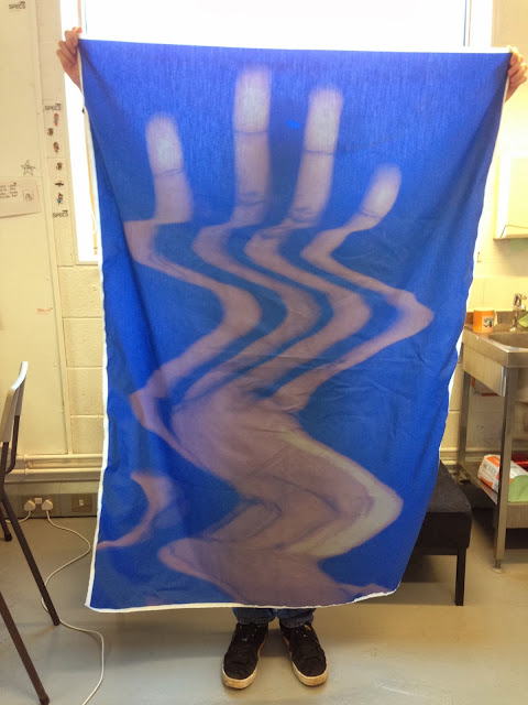
I had never printed onto material before and this is something that I now know is a possibility at college. The colours were far more washed out than I had wanted, and I feel we picked the wrong material. If I was to do it again I would have liked to print the flag onto a heavier canvas.

The design was highly process driven, which was a nice change. The majority of my work comes from arduous concept stages, and I feel that conducting this brief may push me to work in a more organic and process led way. I enjoyed this working method and I will perhaps use this as a tool, depending on the brief in future.


FLAG/DR.ME_BRIEF


Live Brief:
Dr.Me Exhibition


The Dr.Me is the second brief that I have undertaken. The brief is a quick turnaround brief as the deadline was one day to create the visuals. This is far different and somewhat more of a novelty brief than my first live brief. The brief serves the purpose of design as art, as the design will be going straight into an exhibition. This is the first time that I have treated design like this, so it is going to be a new and potentially interesting experience, from process to presentation. 

PORTRAITS_PROJECT


Copyright 2010. All rights reserved.

RSS Feed. This blog is proudly powered by Blogger and uses Modern Clix, a theme by Rodrigo Galindez. Modern Clix blogger template by Introblogger.